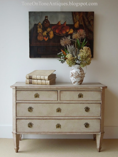
When it comes to accessorizing, I approach it thoughtfully. I love coming up with vignettes that are engaging, interesting, realistic, and above all, pretty! For example, styling a glass fronted cabinet with both dishes and books shows off its versatility and allows the customer to envision the cabinet in either the dining room or library. After all, it's important for me to create shop displays that speak to as many browsers, shoppers, and clients as possible. Here are a few styling and accessorizing guidelines that work for me:
-Style according to theme: color, subject matter, collection, etc. Example: displaying coral and shell collection at beach house.-Decide upon symmetrical vs asymmetrical (but balanced) approach.-Think about scale and proportions. Don't be afraid to make an impact with oversize items.-Layer to create depth, and remember the space beneath.-Vary textures, and keep it interesting.-Take the eye up with tall items such as lamps, candlesticks, etc.-Bring the eye down with small objects that capture attention and invite handling.-Remember function and purpose. Does it make sense to display a silver tea set on a mudroom table?-Create groupings and clusters rather than many scattered items.-Incorporate living, organic, and natural items like plants, flowers, pinecones, artichokes, etc.-Tell a story. Accessories can be more than table fillers. Use unique and personal pieces such as family photos and heirlooms, antique and vintage finds, objects from travels, etc.-Respect the negative space and know when to stop.
If you have suggestions to add, I'd be grateful for you to do so in the comments section. I want to thank my friend, Berta, for asking me to write this post on styling :)
Now let's style this Swedish Gustavian console table!Vignette #1 - I styled this symmetrical vignette with antique blue creamware china appropriate for a dining or living room. On the console is a grouping of three, even though there are many individual items. A platter is layered behind the bowl, which is raised on a stack of books. The vintage Italian stone fruit add texture and invite handling, while the pair of hurricanes take the eye up to the abstract painting. Underneath is a tailored ottoman with an asymmetrically draped throw - both add softness. There is an overall color theme of blues.
Vignette #2 - An asymmetrical but balanced vignette appropriate for the entry, living, and dining rooms. Notice the theme of creamware pieces, especially the little plate holding a key for, say, the front door, china cabinet, etc. In addition to being pretty, seasonal hydrangeas add freshness. Again, this is a grouping of three.
Vignette #3 - I envisioned this simple tableau for a foyer or entry hall. The grouping of two consists of a tall hurricane with candlestick, platter (or tray) to hold mail, and an antique dressing mirror for that last minute look before dashing out the door. Orange pansies in a tiny cordial glass are pretty while the antique magnifying glass is useful. Below is the same vignette except a small painting replaced the mirror. Instead of a painting, framed family photos would be lovely and personal.
Vignette #4 - Here, the console is styled with the living room, library, and study in mind. Many items are neatly arranged in two asymmetrical clusters. The scale of the lamp is balanced by the visual weight of the books. On the books are complimentary accessories such as a marble inkstand, magnifying glass, and fruitwood box - all antiques! In lieu of flowers, ferns in a bud vase add an unexpected and organic touch. Flowers fade, foliage lasts.
Vignette #5 - This last ensemble is simple and dramatic. From the flanking myrtle topiaries to the French tureen set to the paisley throw, it's all about greens here! The topiaries take the eye way up while the unruly moss keeps them from being stiff and perfect.
And that's the conclusion of my first accessorizing post. Anyone want to buy the console? I'll help style it!
Cheers,
Loi


